Using Ghost Product Cards for things other than products.
How to make a post with multiple updates (like live news pages have)? I suggested a product card for each update and some CSS wizardry.

There was a question over on the Ghost forum about how to make a post with multiple updates (like live news pages have). I suggested a product card for each update and some CSS wizardry.
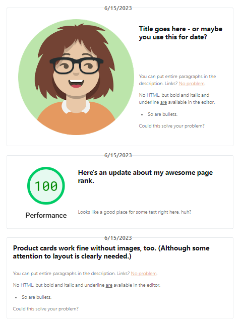
Here's an example:
Do you want some introductory text before your updates start? No problem.
Title goes here - or maybe you use this for date?
6/15/2023
You can put entire paragraphs in the description. Links? No problem.
No HTML, but bold and italic and underline are available in the editor.
- So are bullets.
Could this solve your problem?

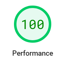
Here's an update about my awesome page rank.
6/15/2023
Looks like a good place for some text right here, huh?
Product cards work fine without images, too. (Although some attention to layout is clearly needed.)
6/15/2023
You can put entire paragraphs in the description. Links? No problem.
No HTML, but bold and italic and underline are available in the editor.
- So are bullets.
Could this solve your problem?
How'd I move the date? Check this out:
<style>
.kg-product-card-description p:first-child  {
    background: pink;
    position: absolute;
    top: 0px;
    left: 0px;
    z-index: 200;
    }
    .kg-product-card-container { position: relative;}
</style>
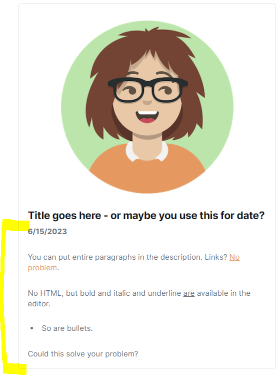
Here's what the product cards look like when I build them in the editor:

A little more styling gives a lot of options! Here's another layout option, still just tweaking the CSS:


