Fixing CLS and other Page Experience issues in Ghost
Does Google Search Console show you have Ghost pages with problems? Read on for how to fix them!

CLS is cumulative layout shift. Basically, it's whether parts of your page jump around as the page is loading. Google cares about CLS: It is one of three core web vitals metrics used for page experience. Pages with a good page experience get a boost on search results, and especially for popular search terms, that's a big deal.
In this post, I'll cover some ways Ghost sites can have problems with CLS (and a few other Search Console issues), and what to do about them.
Portal button problems
The Portal button (the 'subscribe' button that hovers over each page) loads as a separate React app. That means it shows up relatively late on page load, and worse yet, then it changes sizes. The following added between <style></style> tags in your site-wide code injection head [found under Settings > Labs] causes the Portal button to not resize. This is an easy fix. Start there!
    iframe.gh-portal-triggerbtn-iframe {
        width: 183px!important;
        height: 91.5px!important;
        bottom:0!important;
        right:0!important;
    }
Note: If you've changed the wording on the button or the image, you'll need to adjust the height and width. Load the page without the code injection above, then inspect the iframe's size [Right click the portal button and choose inspect. Walk through the elements to find the iframe tag, then change from the styles tab to 'computed' and look at the height and width displayed.] Use those values. If you're using the defaults, you shouldn't need to make any changes.
Announcements Bar
I really want to like the announcements bar. I really do. I had so many clients super excited about it when it was released. But... it's slow to load, and it triggers a bunch of CLS. If Google has suddenly started telling you you have bad page experience where you didn't before, try turning announcements off, or restricting them to subscribed members, to avoid the Google Bot getting mad. A post about alternative options is forthcoming.
Resize the images you can't fix
Ghost themes and the Ghost editor mostly do a good job serving images of the right size and marking images for 'lazy loading' if they're going to end up below the fold. But some of the newer editor features such as split headers do not include the srcset needed to work right, so they try to load a full size image into a half size spot. The best option here is to pick the widest that the image might ever need to be, and to only upload that size. Don't be lazy and upload a 4000px x 4000px image and trust Ghost to resize it. If you build a header-rich page (like https://www.spectralwebservices.com), two things will go wrong:
- Images will be served much too big for the slot they're going in.
- Images won't be lazy-loaded, so they'll all try to load immediately, even if they're not visible initially.
Taken together, that means a much slower time for the images and javascript and fonts that do matter to finish loading, and CLS as a result.
I'm linking an issue for header images. If it's still open, you probably need to do this if your front page looks like my front page.
Add aspect ratio, length, and/or width.
Check images above the fold. Give the browser as much information as possible about those images. The sooner the browser knows how big the images are going to be, the sooner it'll quit wiggling things around to fit it. This can be accomplished with some CSS in code injection, if necessary. Even if you don't fix all your blog posts, you may want to fix the big hero image on your front page. (I'm looking at you, Solo!)
Fix your logo
Unless you're sure your theme is specifying the right size of your logo, don't trust it. Upload your logo as the actual size it needs to be.
Too many themes don't hardcode the dimensions of the logo, to give you extra flexibility on logo size. Thanks, but no thanks. Pick your dimensions and include them in the CSS or the theme files.
Add CloudFlare
I found that adding proxying Rocket Loader (from Cloudflare) to my site, along with fairly aggressive proxying of images helped improve my page speed a bit. My cheap-o virtual server package goes a lot faster with a proxy in front. [If you're on Ghost Pro, you've automatically got caching from Fastly, so you may get less impact by adding CloudFlare.]

Here are the caching rules I'm using. This one rule targets the site's images, assets, and css. I don't cache the actual pages themselves, since I have member-specific content on many of them.
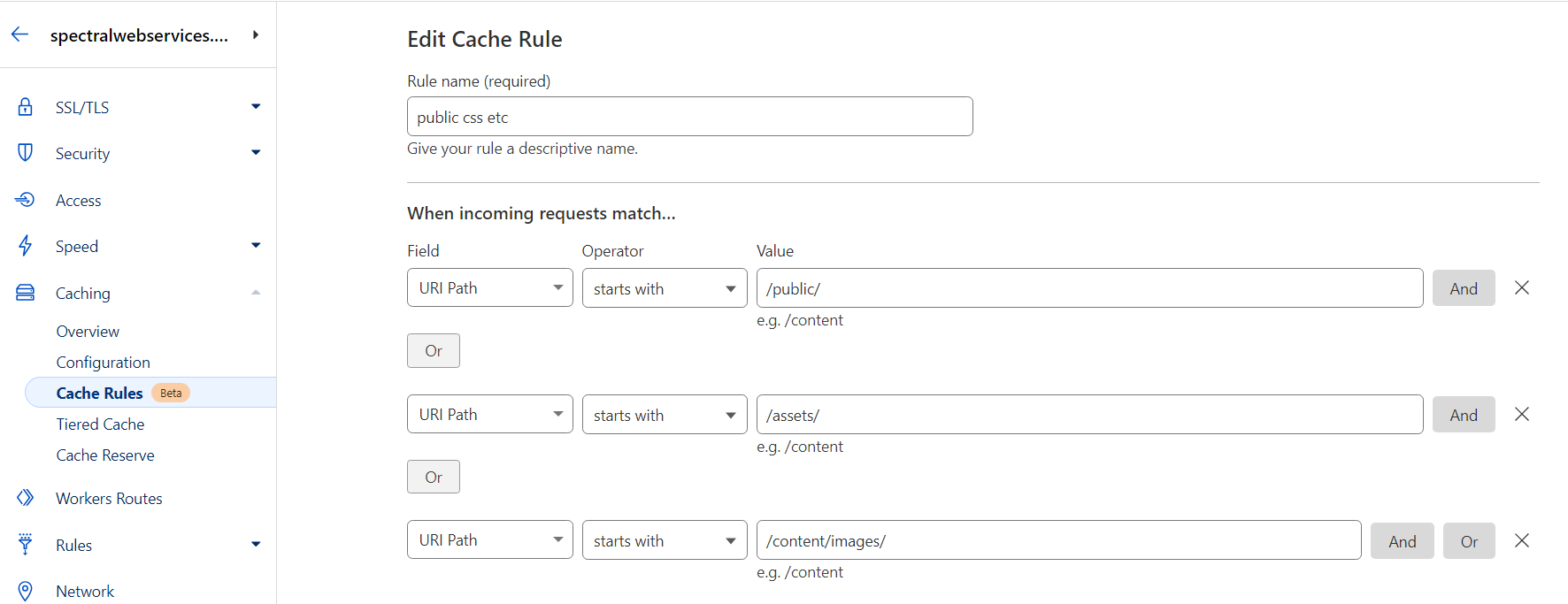
Note that if your site is under active development, having your assets folder cached is going to be confusing and/or annoying. Don't cache assets if you're actively working on the theme files.
"Page too wide" and other dimensions issues
This one isn't a CLS error, but you may notice it show up in Google Search Console as 'page too wide' under 'mobile usability', so I'll include it here, because it can drive you utterly batty trying to find an element that's too wide, when nothing looks too wide.
The Google Mobile Crawler's behavior is weird. It doesn't actually scroll. Nope. If your page is too long to fit on one simulated screen, it just makes the screen longer, until all your content fits. Which sounds fine, unless you're using the css unit 'vh' or 'vmax' on an element width. As the Google Bot expands your page's height to make your content fit, those values can get crazy huge, especially for long pages with lots of content. In my case, there was some horizontal padding that depended on vmax, and so I had elements with 1000s of pixels of padding. Needless to say, those padded elements didn't fit on Google's simulated phone screen very well.
This is a must fix if you're seeing it, because Google won't serve search results for a page that it thinks is bad on mobile to any mobile searchers.

A forum post discussing the problem.
Final thought: Less above the fold
I've gone back and forth over whether my front page should have a full height hero section. The illustration I want to use is pretty wide, so it feels like a lot of unused space. At the same time, the difference in apparent load speeds and CLS is pretty huge. Avoiding having a second image above the fold (and a second chunk of text that gets pushed down by the second image) has a big impact.
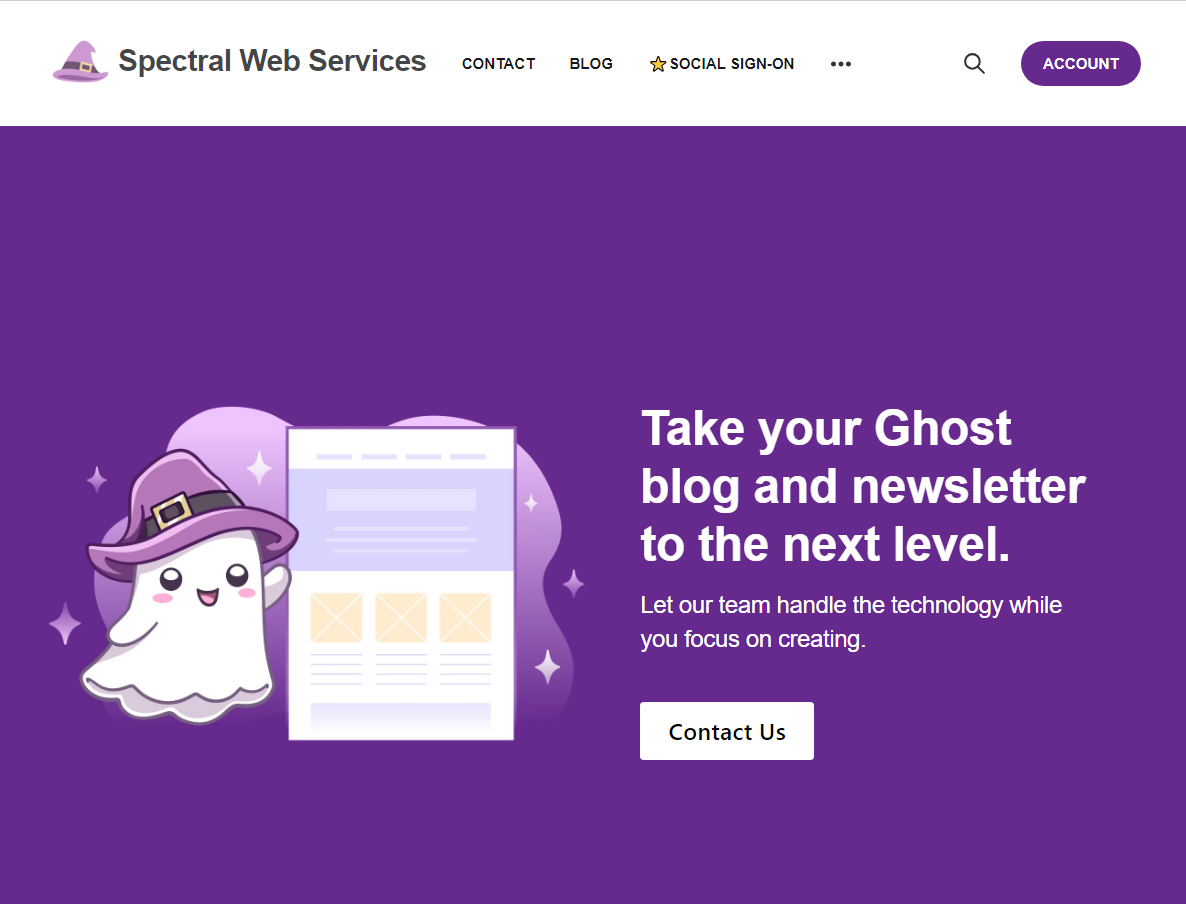
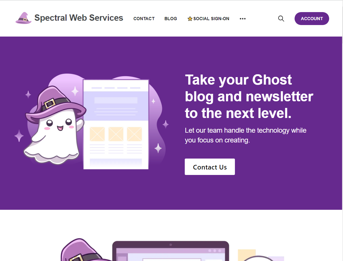
I started out thinking I wanted to adjust this for just desktop, but in fact, the gains are bigger on mobile. (And it looks better, too, I think!)

Sometimes, less really is more. What's the benefit to showing users the edge of the next image when they first land on the page?
On my list for future work: I'd really like the ability to load less JavaScript than the default in {{ghost_head}}. I don't need the comments code loaded on pages without comments functionality. I don't really want Ghost's built in search making API calls on page load. I'm not even sure I want to load the javascript at all until a user clicks the button. I don't need Portal making API calls to get the available tiers when the page loads. And although apparently Stripe says their Javascript should load on every page, it'd be nice to serve at least the landing page without it. (Ridiculously, Stripe's JavaScript gets served with one and five minute cache TTL, which means web visitors who read multiple pages are likely to load that .js again and again and again....)
Hey, before you go... If your finances allow you to keep this tea-drinking ghost and the freelancer behind her supplied with our hot beverage of choice, we'd both appreciate it!
