Can we talk about the announcement bar?
I really want to love the announcement bar, and yet...

I really want to love the announcement bar. In the year before it was released, I did at least three separate Ghost theme modifications to add an announcement bar. Clients wanted it, so I was delighted to see it become part of the Ghost core.
And yet.
This is the PageSpeed report for my demo site (which lives on Ghost Pro), running the new Source theme.
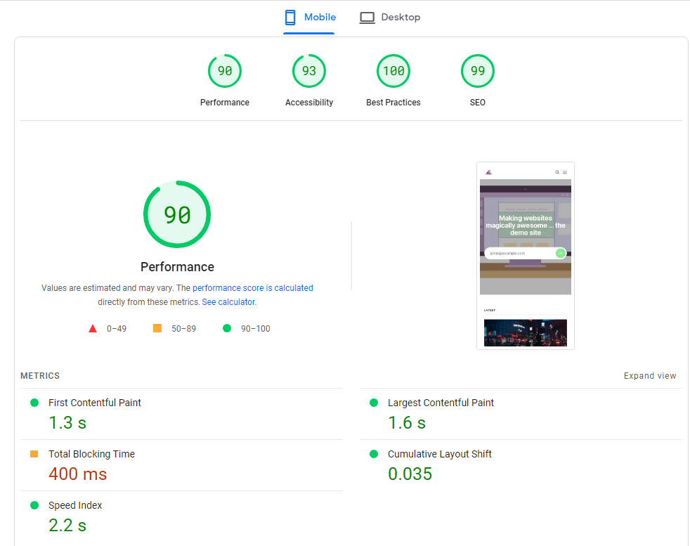
No CloudFlare, no fancy optimizations, just theme out of the box, pretty much. Portal is on (although the Portal button is not) and all the members functionality is loading. That's my demo site's front page. It's pretty consistent. Sometimes performance is 91 instead of 90, depending on exactly how fast the CDN scripts load. It doesn't move much. The cumulative layout shift (CLS) sits right around 0.035.
Now, here's what happens when I add an announcement:
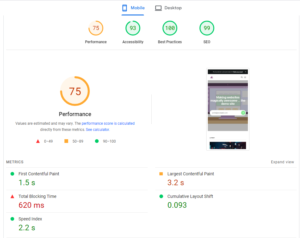
The performance score seems to jump around (due to TBT variation), but what's totally consistent is the CLS. It jumps consistently from 0.03-something to 0.09-something on mobile. On desktop, still using Source, the CLS is a lot smaller, but it's still a jump from 0.004 to 0.039.
These are pretty small changes, right? Are users actually bothered by the announcement bar showing up a fraction of a second late? To my eye, it's not bothersome - lots of sites have announcements that pop up late. But to the Google Bot, this is a problem.
In Google's Core Web Vitals, a CLS > 0.25 is a Poor score, and CLS > 0.10 is a "Needs Improvement" score. So do we care? Well, to quote Google:
How important is page experience to ranking success? Google Search always seeks to show the most relevant content, even if the page experience is sub-par. But for many queries, there is lots of helpful content available. Having a great page experience can contribute to success in Search, in such cases.
So sure, if you're the only one posting content about something truly obscure, it's OK if your page experience scores are poor. But for most of us, our pages aren't the only thing out there, so Core Web Vitals matters. If you going to load analytics, or Google Tag Manager, or custom fonts, or icons, then you probably can't afford to let the announcement bar add 0.03-0.06 on your CLS score, if you're going to keep is under 0.10.
Why is the announcement bar late to the party?
Why is the announcement bar showing up late? Here's the network calls (on "Fast 3G simulation in Chrome dev tools):
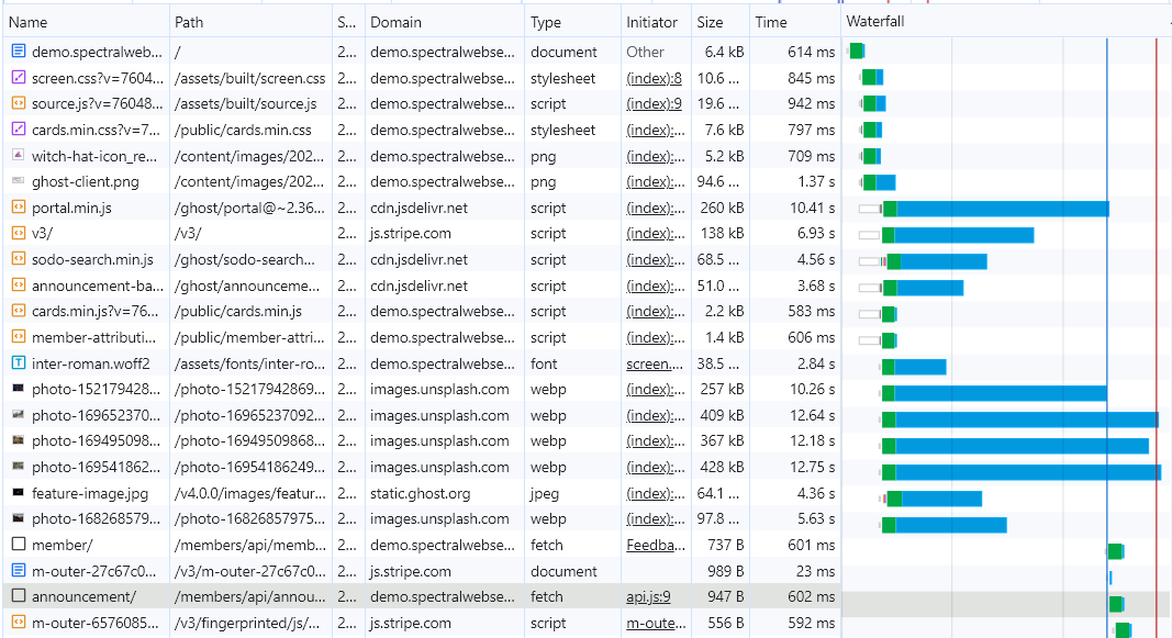
The announcement bar JavaScript loads fairly early, but it doesn't make the network call to the announcement/ endpoint until late in the page load. 12 seconds in on "fast 3G". Lots of users have faster internet, but the point is that the content for the announcement bar loads late, and no space is reserved for the bar, so CLS results.
It's an interesting design choice. If instead there were an @announcement object available in Ghost's dialect of handlebars, then it would be easy for theme creators to build in an announcement bar. Instead, Ghost is 'talking to itself'. The page tells the browser to load the announcements-related JavaScript, and then that JavaScript makes an API call back to an API endpoint on the site to get the announcement bar content.
But what if you really want announcements?
The way I was adding announcements last year is a lot CLS-friendlier. In brief, it goes like this:
- Edit the theme to include an announcements banner. Code it right into default.hbs. If you want to only show it to members or non-members, code that right into the handlebars.
- Store the contents of your announcements banner somewhere. A custom field is a fine option. For clients who wanted more options (text AND color AND a link AND a background image), I instead created a page that stored all the announcements content, and just pulled in the parts I wanted with an extra {{#get}} request in the template. (There's a small impact on page load time for adding an extra {{#get}}, but it's mighty small, and doesn't impact the CLS.)
Oh hey, look! There's already a detailed tutorial on how to add an announcement bar that's similar to how I've done it. Thanks, Roman!

All this approach (mine or Roman's) is missing is an admin panel interface to make it easier for users to use. And it's fast.
So, if you could choose a nice admin panel but your pages would rank lower in Google, what would you choose?
And that's why my site isn't using the announcements bar.


